Summary
Rakuten Top Page Improvements (Smartphone & Tablet)
Increased GMS (sales volume) and CVR (conversion rate) via designing, coding, and A/B testing of several test versions on Rakuten's top page.
GMS +581.2 MM JPY/month (Smartphone), +141.6 MM JPY/month (Tablet); CVR +0.99pt (Smartphone), +2.56pt (Tablet).
Received the Rakuten Award Second Place.
The Problem
We wanted to increase conversion on the home page.
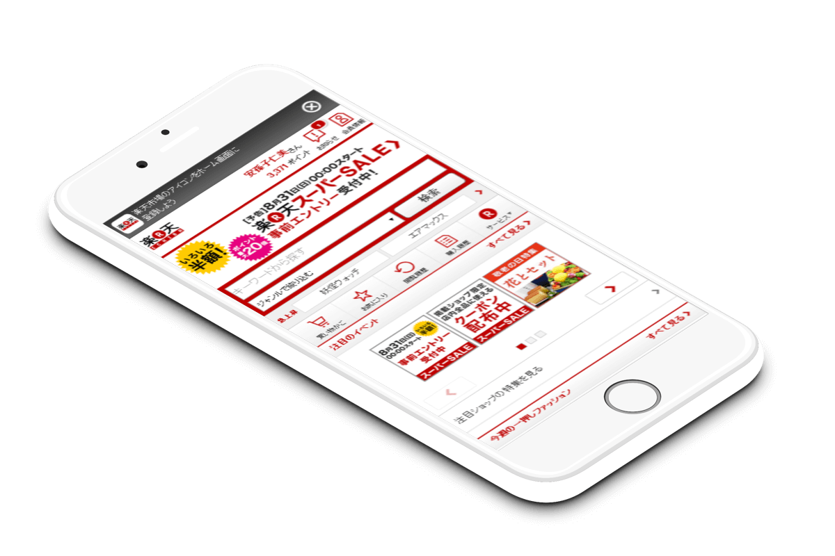
Rakuten is a Japanese e-commerce platform. It seeks to support its merchants by helping to sell their goods. One way it does so is via its top page, by displaying products to the user.
We analyzed site data on a regular basis, and knew that the Browsing History area of the page had good CVR (conversion rate) and GMS (sales volume).

Yet, on the smartphone page, product images were quite small, at 80px x 80px. A typical user might have to squint to see. What if we made them larger and clearer? Would products look more appealing, and hence improve CVR?
We believed improving the Browsing History area would have a large impact on CVR and GMS.
The Process
Knowing our users
We knew that our most frequent shoppers were women in their 40s, though our smartphone and tablet users tended to be younger.
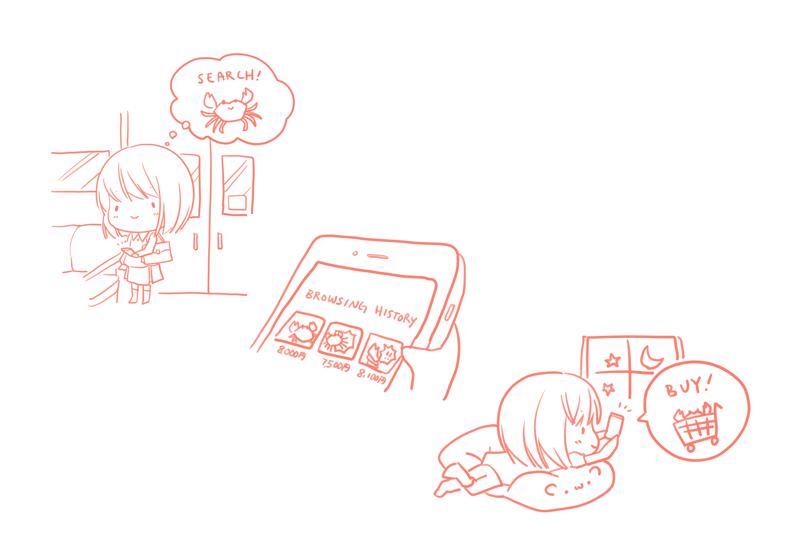
One common way people shopped on Rakuten, as described by users in a separate user test, was to search for items of interest on the go, such as on a train, and come back to buy the product when they got home.
This suggested a common use case would be to find and buy a product of interest from the Browsing History area when they were in the safe comfort of their homes.
Design Changes
We shouldn’t be forcing anyone — especially people who might have trouble with their vision — to squint to see tiny images. At the same time, making the products too large meant showing fewer products overall.
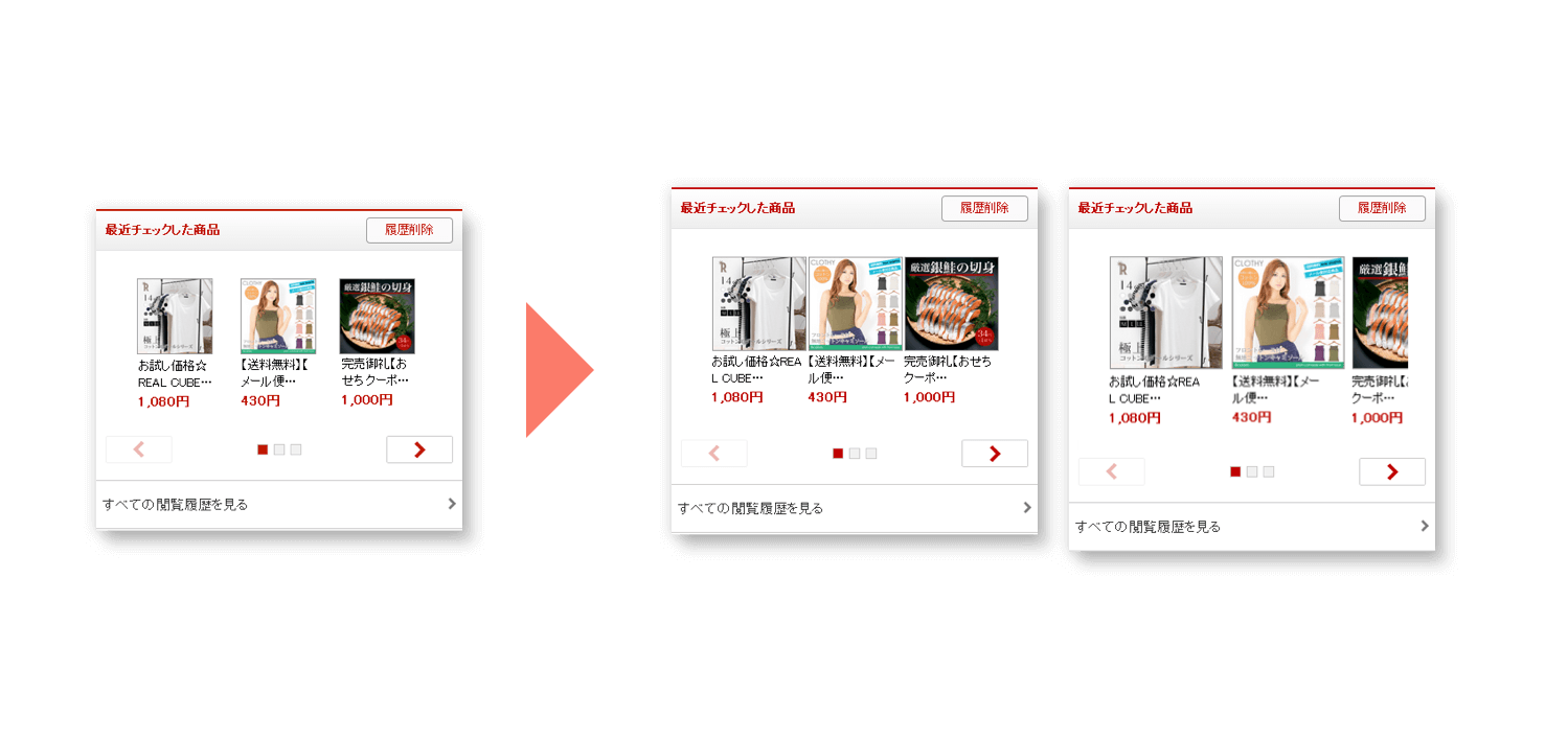
Would users prefer to see 2 and a half large, crisp images (120px x 120px size), or would they prefer 3 slightly smaller images (100px x 100px size)?
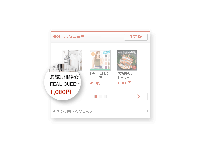
Another consideration was, will they read the product title? The product title was often a jumble of keywords, like "free shipping" or "sale price," and truncated before the actual product title appeared. We didn't know if that was useful to users.
So, we were reasonably sure that increasing image size would have a positive effect, but was uncertain what would happen if we removed the product title.
Coding
I coded HTML prototypes for the smartphone and tablet pages, with the increased image sizes. There was some light JavaScript adjustment involved for the 120px x 120px version. My team leader and I presented them to the head of the department, and we received approval to move forward with the A/B test.
A/B Testing
I worked with a templating system (Smarty), using server side includes to implement the various versions for the test. Adobe SiteCatalyst tracked link clicks and purchases. I used it later to compile the data and analyze results for our A/B test.
We ran the A/B test for a couple of weeks, evaluating the CVR and GMS for 6 beta types. Each beta type received 10% of all user views.
Experimental Setup
| Image Size | Smartphone | Tablet |
|---|---|---|
| 80 x 80 | SP 80 x 80 | TAB 80 x 80 |
| 100 x 100 | SP 100 x 100 | TAB 100 x 100 |
| 120 x 120 | SP 120 x 120 | TAB 120 x 120 |
The Results
Enlarging the Browsing History images increased GMS and CVR.
Image Sizes
We got positive results for increasing image size. There was not a large difference between 100px x 100px and 120px x 120px. We preferred to show 3 full images on a smartphone screen, as opposed to fitting only 2 and a half with the 120px x 120px size. For these reasons, we officially released the image size increase to 100px x 100px.
Product Title
During the test, we noticed that the versions with the product title removed had reduced CVR and GMS. We pulled them out, with the conclusion that there needs to be some kind of text under the image. We speculated that perhaps there is comfort in seeing that text description there, rather than seeing a bare image.
Results
| Smartphone | Tablet | |
|---|---|---|
| GMS | +581.2 MM JPY/month | +141.6 MM JPY/month |
| CVR | +0.99pt | +2.56pt |
*To get the numbers here, we adjusted it to if it were full 100% exposure (as opposed to 10%), and projected it to expected results over one month. Although a small change on the site, it had a large impact in terms of GMS and CVR.
I received the Rakuten Award MVP Second Prize for this project.
Possible Future Iterations
We could experiment with the order of areas on the page.
If I were to continue improving sales and conversion from the home page, I could experiment with the location of the Browsing History area. Predictably, areas that appear near the top of the page receive more clicks. The top page is prime real estate, and different departments competed to display banners and receive visitors. Therefore, a balance was necessary to satisfy stakeholder needs, while delivering customers the content they want to see.
We could also see if simplifying the design would improve conversion.
Another open question was the general "busy" feel of the design. What if we increased whitespace, and deemphasized the design around the products? Though it is risky to change the design this radically (we often saw large drops in CVR and GMS in such tests), toning down parts of the design in future A/B tests may produce positive results.


Hitomi Abiko
UX design, front-end development, some Rails, some anime art. Driven by curiosity and a desire to make the world a better place.