Summary
Brief
Blackboard was sunsetting its Voiceboards service, which was integrated into VHL Central. It provided a way for teachers to create discussion boards that allowed for audio recordings. We needed to provide a similar tool to our customers, as they had paid for that functionality.Team
- Product Manager
- Three developers
- Myself (UI/UX)
Roles
- User Flow
- Interaction Design
- Visual Design
- Clickable Prototype
Time Span
October 2016 (~2 weeks)
The Challenge
We needed to create a replacement for Blackboard's Voiceboards. Students and instructors needed to be able to post to a discussion forum and include audio recordings.
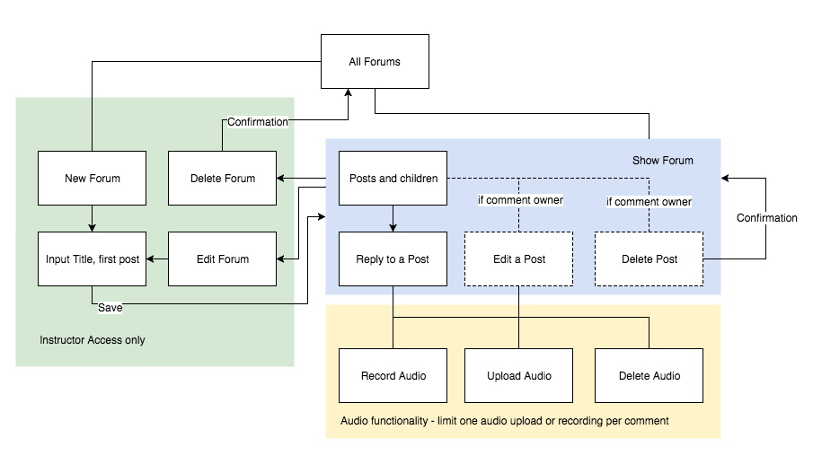
User Flow
I have some experience with Rails, so I thought Forums would be a standard CRUD. I created a user flow to describe this structure, as well as clarify details and user permissions.
Iterations on the UI
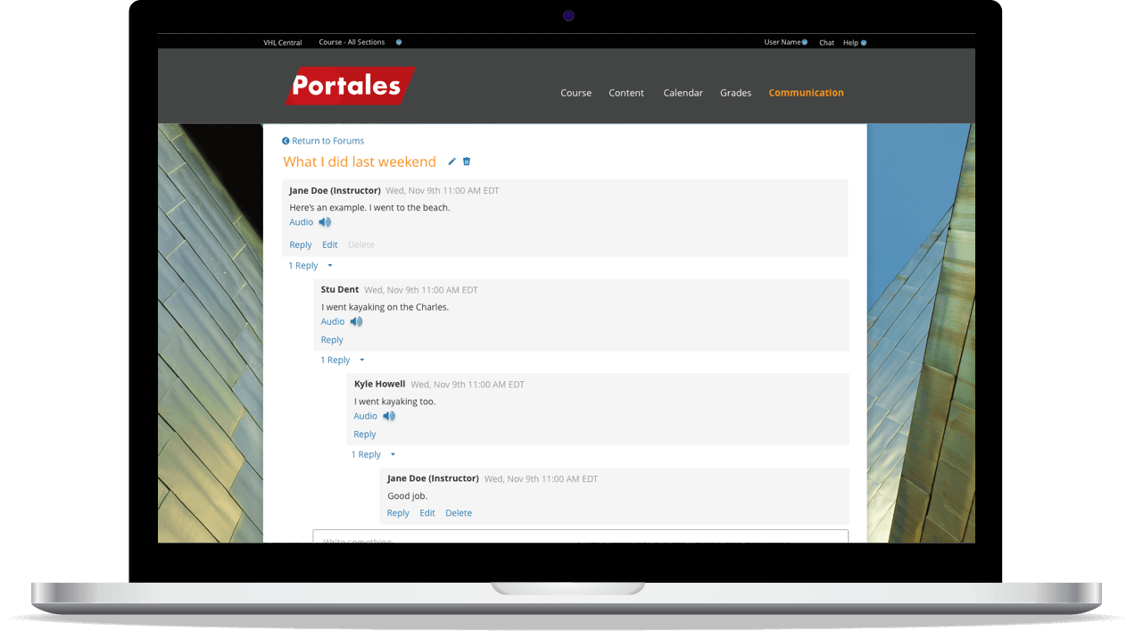
I used some of our style guide colors to put together a quick mock up of what I believed was more or less typical discussion functionality. An instructor can create a Forum for their section. Instructors and students can then post on the newly created Forum.
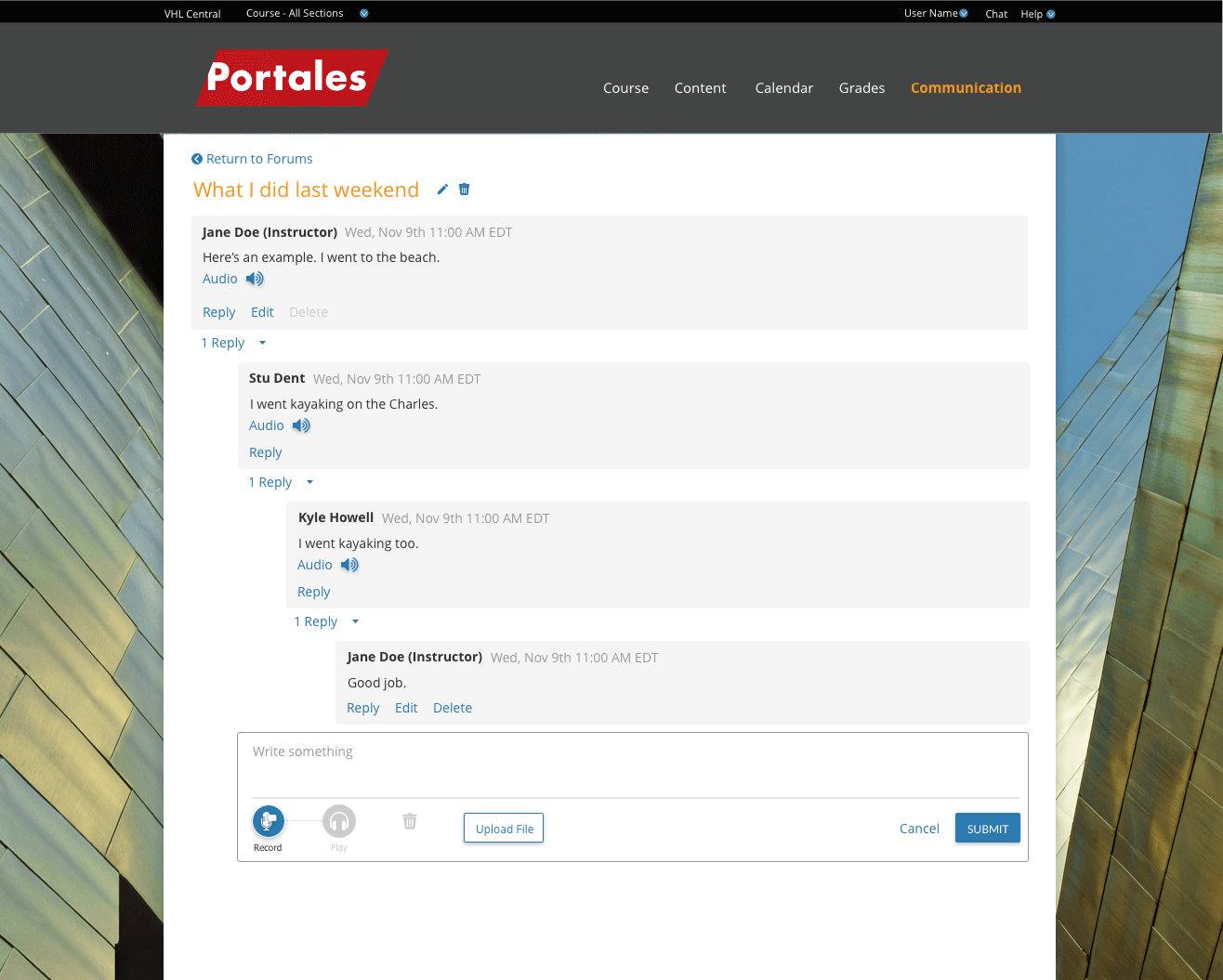
Designing the post
I removed the avatars from the designs, as most users don’t bother uploading an image. I also consolidated elements about each post (name, date, etc.) into one panel to be more explicit about which details are related to which post. I moved the controls for each post towards the left, so that users don't have to reach to reply to a post.
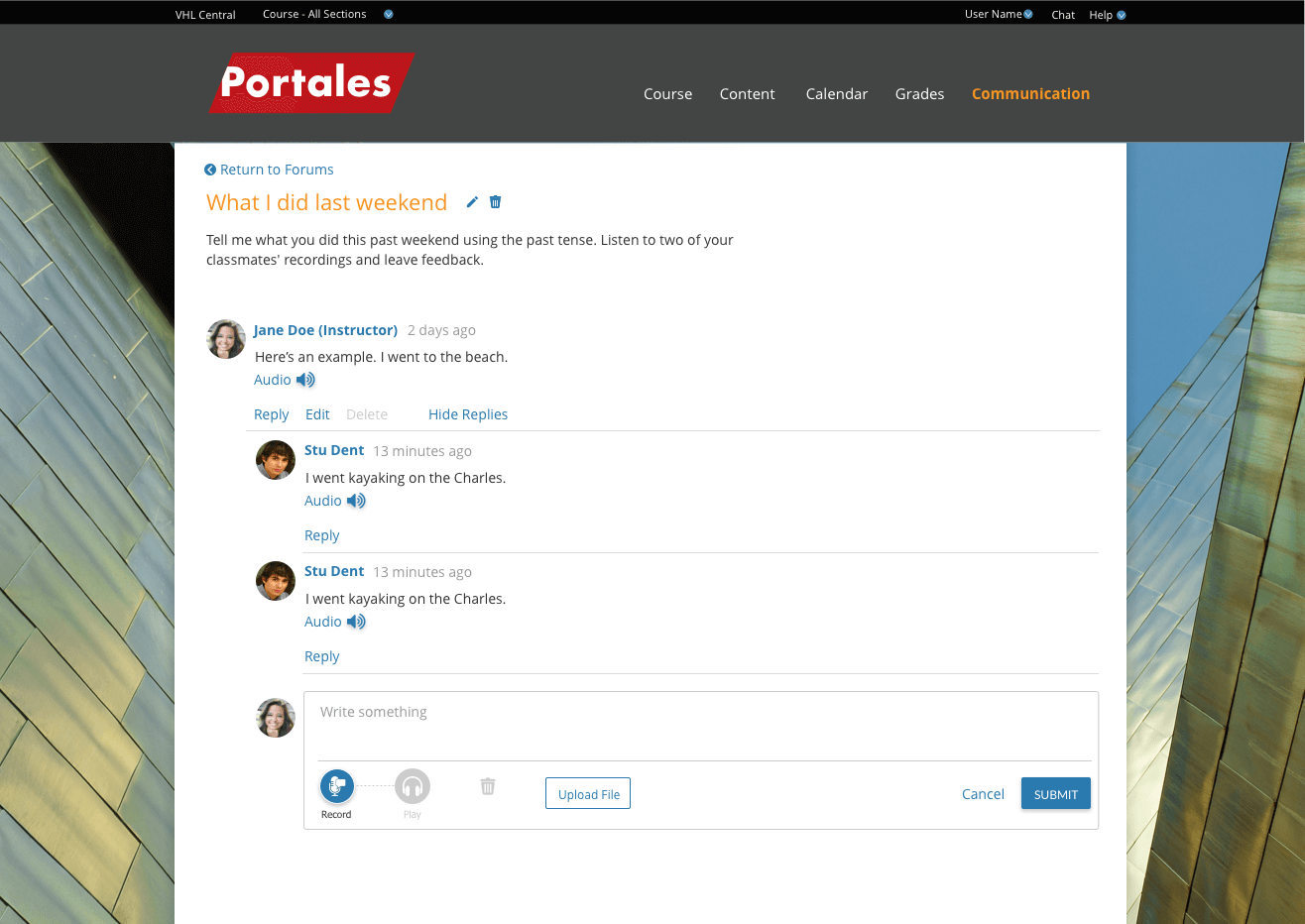
Adjusting the Date/time format
Although the date format looked more modern when it was in relation to the current time (e.g. "2 minutes ago"), instructors are often more interested in whether or not a student submitted on time. If they are comparing the post's date to a specific due date, writing out "Wed, Nov 9th" made more sense.
Whitespace adjustments
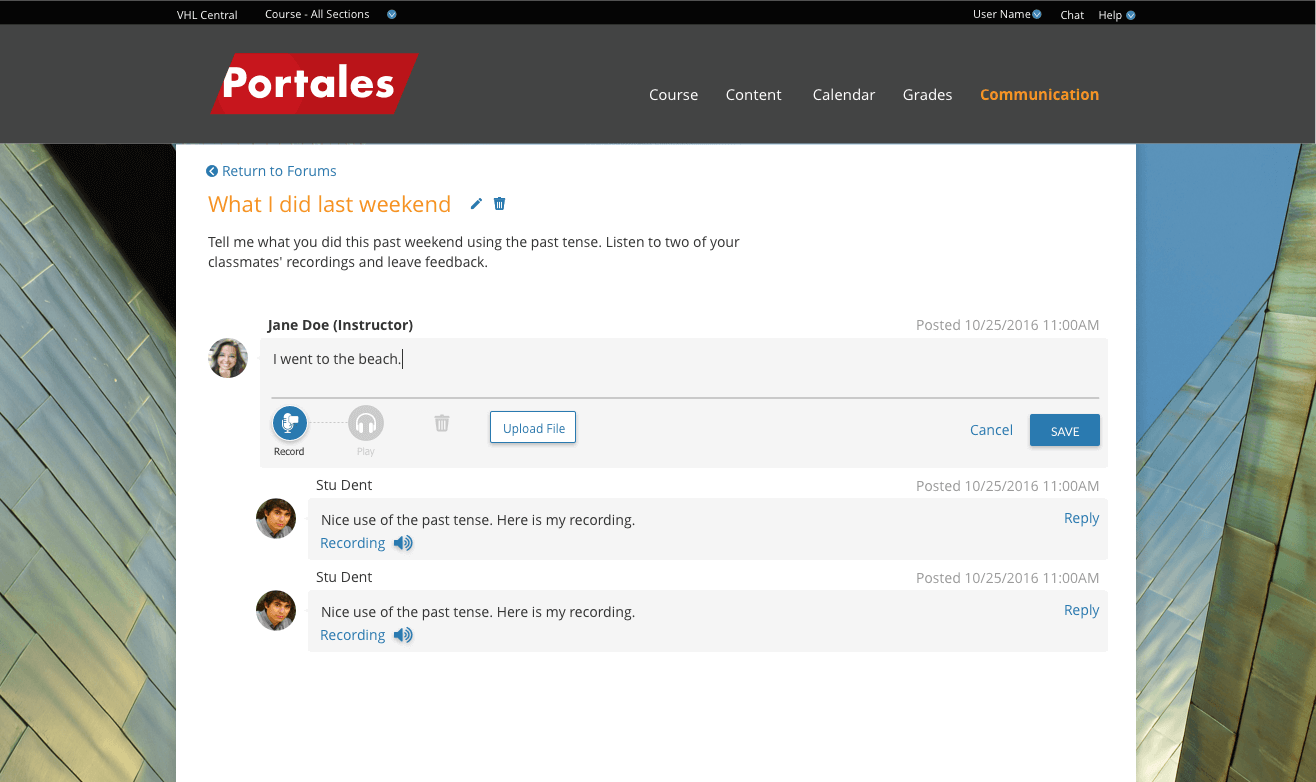
Also, our PM, who used to be an instructor, pointed out that he'd prefer to see more replies on his screen if he is grading responses from his students. Though I preferred to give the elements more breathing room, I scrunched up some of the vertical space to respect those wishes. (If I had the resources, I would have run this by a few instructors.)
Deliverables
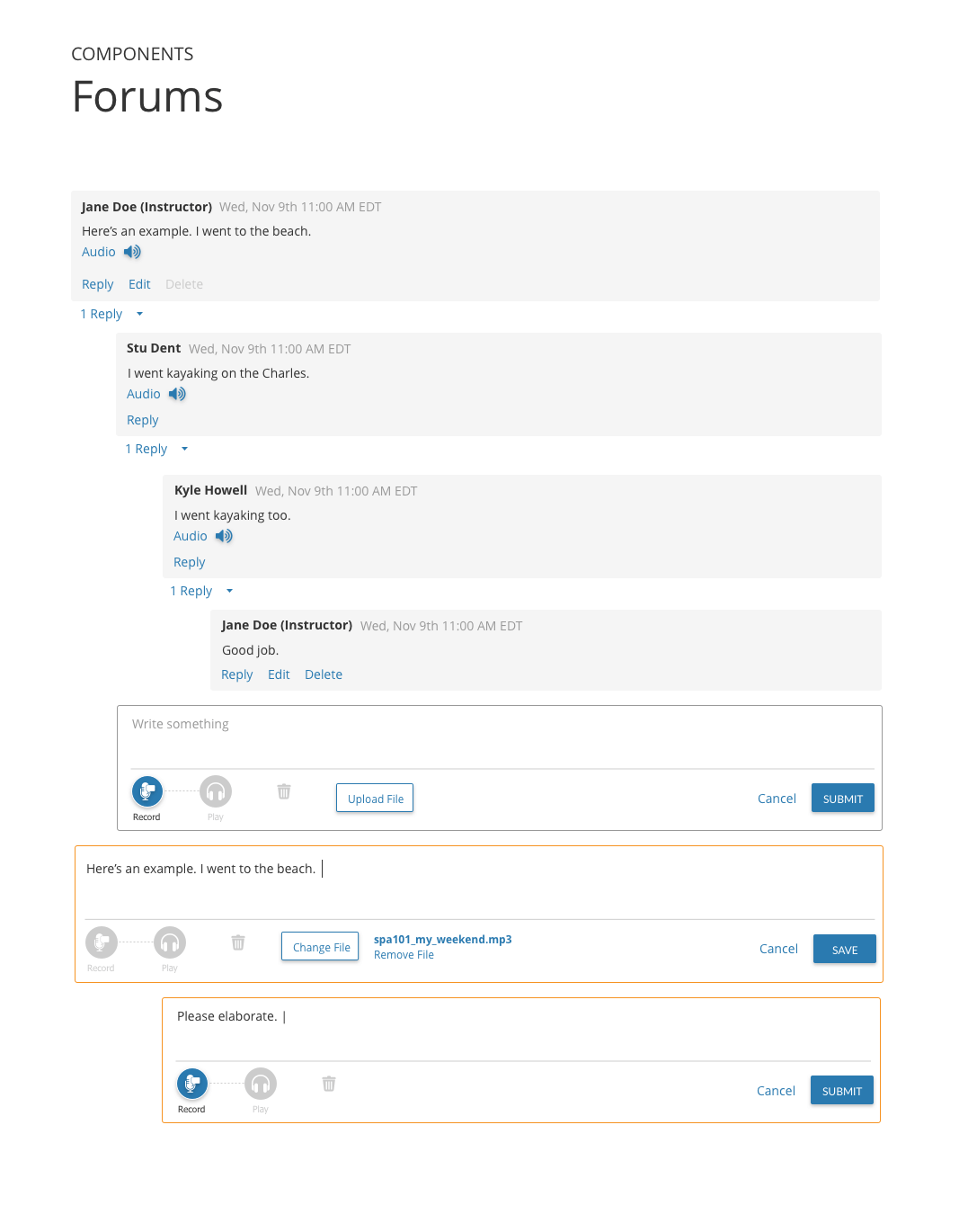
Components list
I made a quick visual components list and their states for the devs working on Forums. More comments are included together with the prototype.
Future Iterations
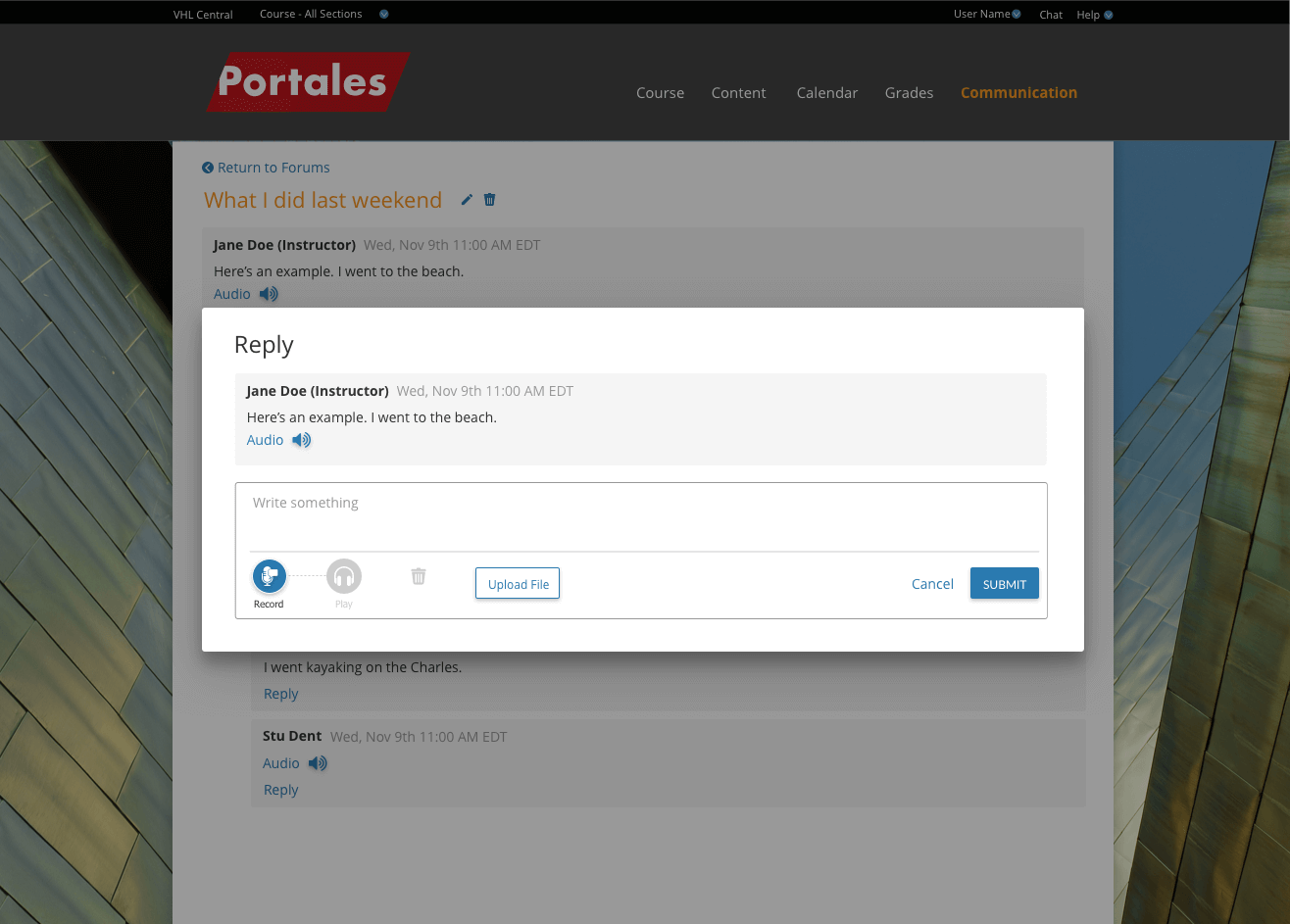
Replying in a modal
After the initial release of Forums, we were uncertain the way a user replied to a post made sense; there was a lot of jumping around. I created a new design for having the reply in a modal window, showing only the message that a user was replying to directly. Though students might be tempted to look at other people’s answers, they should be focusing on the question asked by the instructor, as they are directly responding to this. This adjustment will be implemented in the near future.
Evaluating the design with data and user testing
We have rolled out this feature in December 2016. From the few statistics we have, we know that there are some users on Forums, though many are only testing out the functionality.
If this feature becomes a priority again, I would like to view some Forums that users have created to learn how they are used. Testing with existing users would be useful as well. There may be untapped business opportunities depending on how instructors use tools like these to facilitate their class, and user research may help uncover some of them.
Things I Learned
Bouncing ideas off of non-designers is useful, especially if you're the only designer. This was my first project as the sole UX designer (prior to this, I had a boss who was a UX designer). Since then, I have been looping the front-end devs I work with into whiteboarding together. This helps keep them informed of likely design directions. It's also great feedback and a good way to build camaraderie. (Of course, it is important to communicate clearly what directions are certain and which ones are still up in the air.)

Hitomi Abiko
UX design, front-end development, some Rails, some anime art. Driven by curiosity and a desire to make the world a better place.