Summary
Improved information architecture and navigation
Redesigned the Support page to reduce customer calls to Tech Support. Released August 2016.
Article views increased by 13%, and searches dropped by 20%. This suggests users are now better able to find articles they need without having to search.
The Problem
Tech Support wanted to reduce the number of calls they received.
Vista Higher Learning provides online language learning programs for instructors and students. The Support Center covered topics on this platform, but Tech Support still received many calls.
We thought that, by improving the Support page, users could help themselves before calling.
Improving the navigation and info architecture would allow more users to help themselves before calling.
The Process
User Journey
We wanted the user journey to end with a self-help solution.
Typically, a user would encounter a problem on the site, and seek help. We had links in the header and footer to the Support Center. Ideally, a user would find an article to help themselves in the Support Center, without having to call Tech Support.
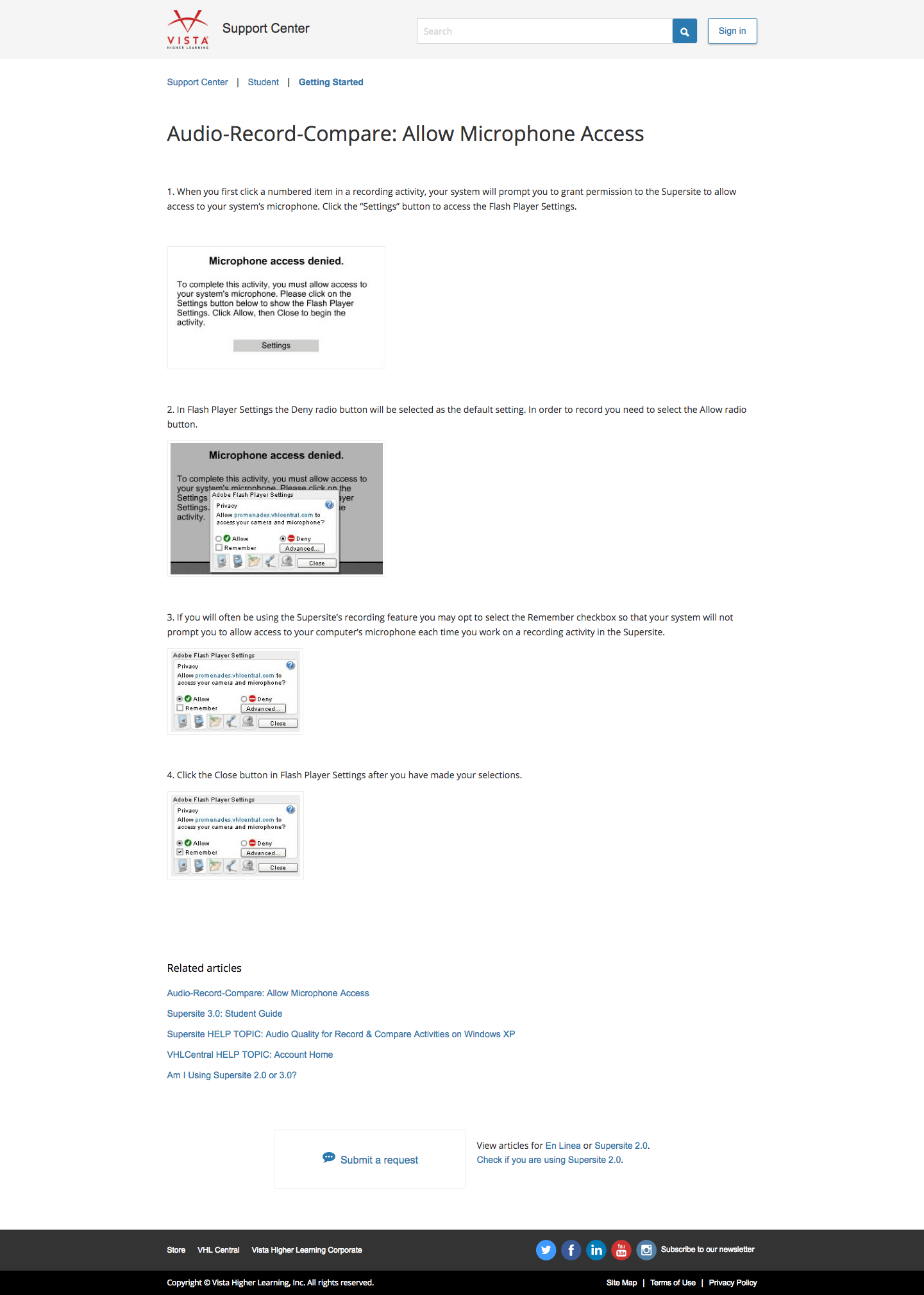
Evaluating the Existing Design
However, the existing design made it difficult to navigate to desired articles.
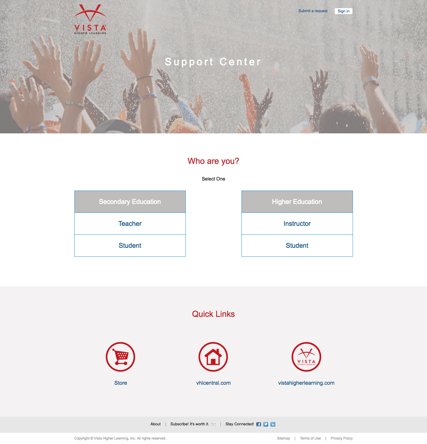
The Support Center was a site maintained on Zendesk.
The first thing a user must do here was to choose who they were, and understand what "secondary" and "higher ed" meant. There was no search on the home page, so the user must choose.
According to Tech Support, the "Quick Links" at the bottom were at Marketing's request, to increase traffic to the Store. However, their prominence is at odds with the purpose of the user's visit here -- to seek help.
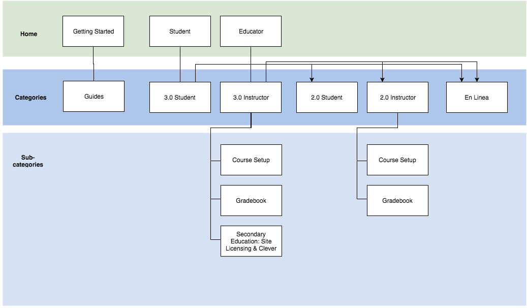
Sitemap for Existing Design
I created a sitemap for the existing structure.
In Zendesk, the three levels are "Categories," "Subcategories," and "Article." "Home" is something I added to represent what is accessible from the home page.
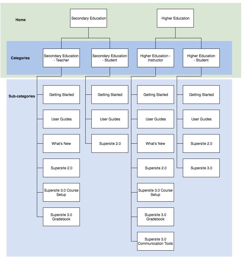
Here, it is evident that there is a lot of copy-pasting -- the articles in the lower levels, in fact, were duplicates.
We were also trying to phase out SuperSite 2.0 and En Linea (older products), but they showed up prominently in the categories.
Proposed Sitemaps
By simplifying the information architecture, navigation became more straightforward.
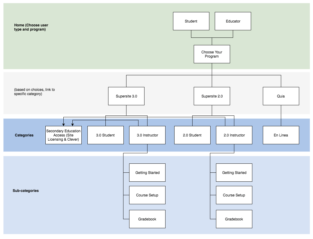
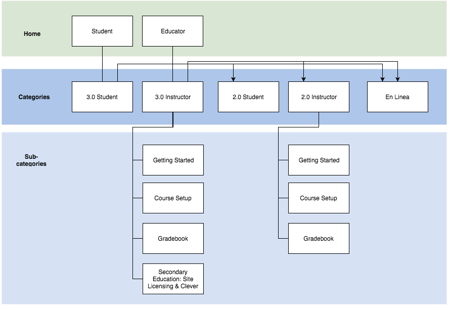
We settled on the third one, showing only Instructor and Student categories on the home page. Links to SuperSite 2.0 and En Linea were deemphasized.
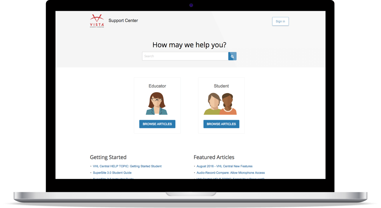
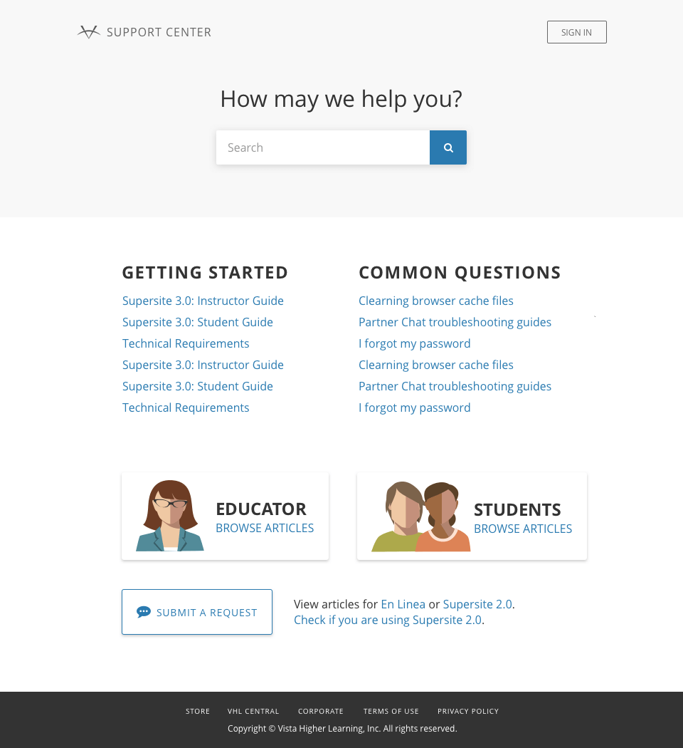
The Design
I added a search bar, Featured Articles, and simplified as much as possible. I used our WIP style guide to inform my visual design decisions.
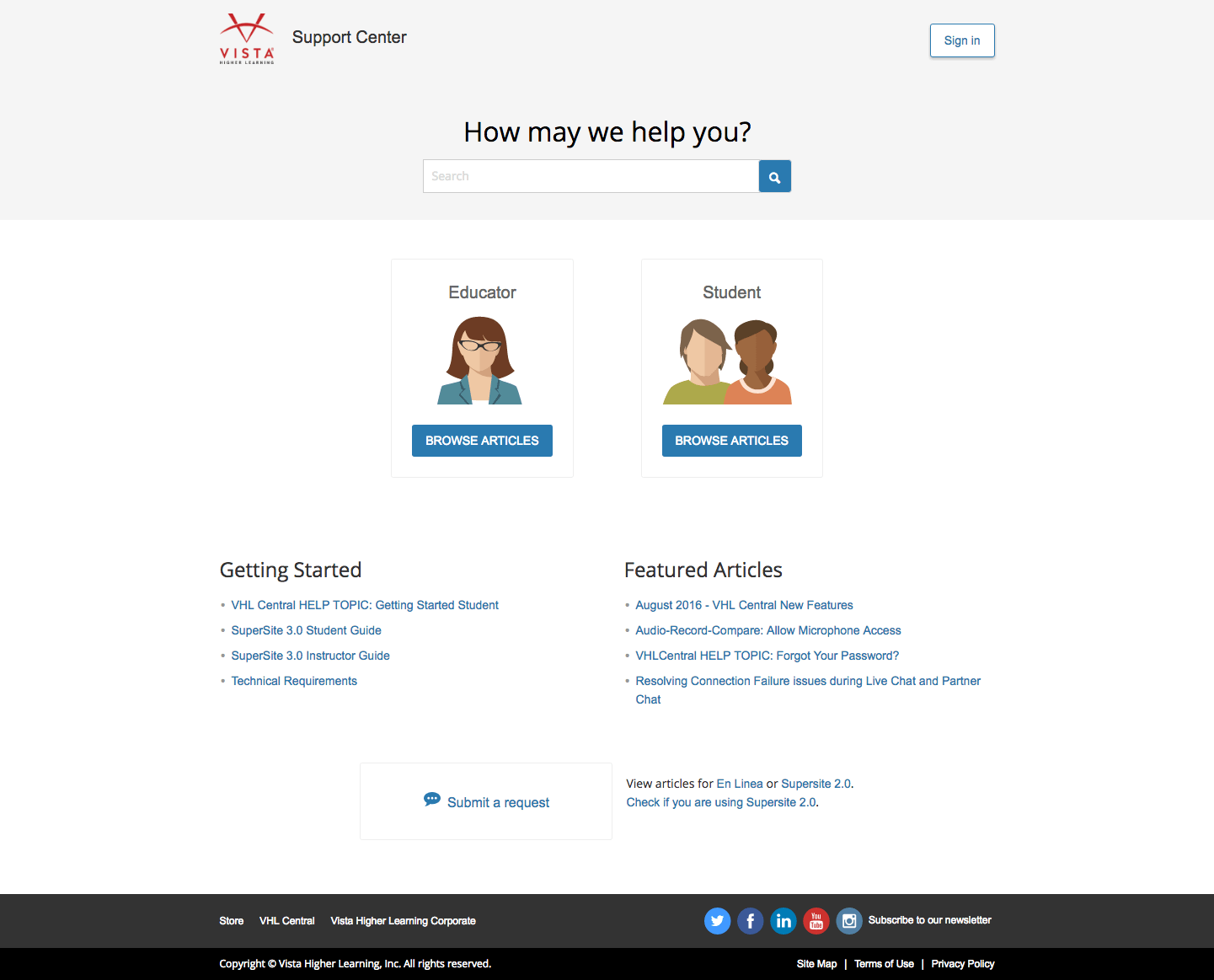
The idea was to keep it simple and straightforward; I didn't want to confuse a person who was there because they needed help.
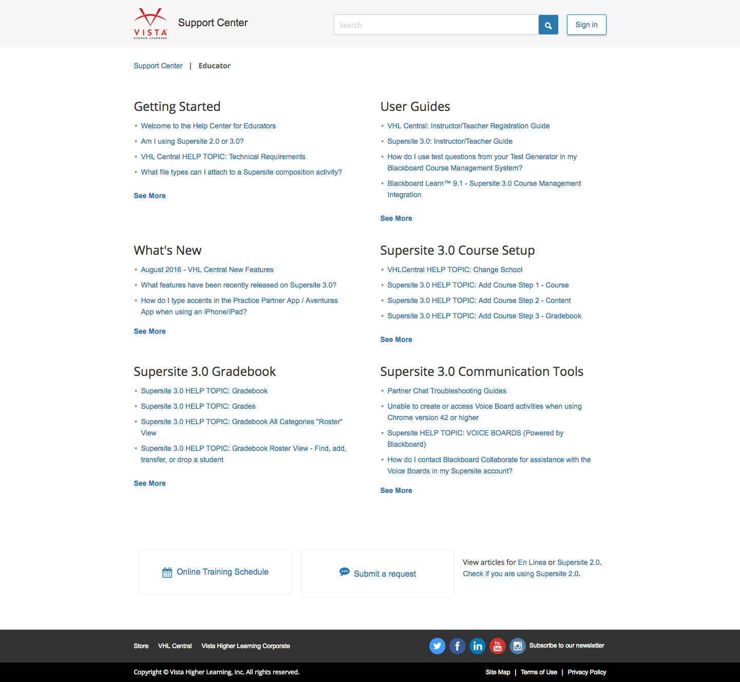
I added a search bar to every page. I also added the Recommended Articles widget on article pages, so that a user would have a place to go if they couldn't find the answer in that article.
I added Featured Artiles and Getting Started sections on the home page, anticipating common reasons for visiting the Support Center.
My boss made the little people icons to include in the designs. I received feedback from him, Tech Support, and Product, in order to finalize the designs.
Implementation
I modified the HTML and CSS in Zendesk, and added JavaScript for some simple logic.
There wasn't much priority in terms of cleaning up the code, so I made some quick modifications to the front-end, without rewriting too much of the code.
In order to make the information architecture work, I reorganized the articles as well.
The new design was released in August 2016.
The Results
Comparing February 2016 to February 2017, article views increased by 13%, and searches dropped by 20%. This suggests that users are better able to find articles without searching.
More page views probably means more articles were seen, which means people are using the Support Center site (as opposed to calling tech support).
Of course, the ideal metric here would be "phone calls to Tech Support." However, as I do not have that data, I looked at these other metrics on Zendesk.
Next Steps
In continuing this project, I would communicate with Tech Support about which areas receive the most calls, in order to better lead the user to a self-help solution.
Following up with the stakeholders, user testing, and delving into the Zendesk statistics would better inform future design decisions.
I would probably also clean up the design a bit, perhaps making the frequently asked questions higher than the people icons. If they can find their answer there, it would be faster than browsing all the articles.

Hitomi Abiko
UX design, front-end development, some Rails, some anime art. Driven by curiosity and a desire to make the world a better place.